

Getting Color Right

GETTING COLOR RIGHT
Color is a funny thing.
Most of us don’t spend much time thinking about color. We know the grass is green and the sky is blue. Then one day someone tells us they painted their kitchen cabinets “Unicorn Secrets,” and we all just nod like that’s a perfectly normal thing to call white.
We all assume color is straightforward.
It isn’t.
Think about the last time you painted a room in your house. You did your research, picked the perfect color, and confidently rolled on the first coat. Then you stood back and thought, Oh no. As it dried, it got better. Later that evening, you flipped on the overhead lights to admire your work, and suddenly the color looked different all over again.
Color is complex.
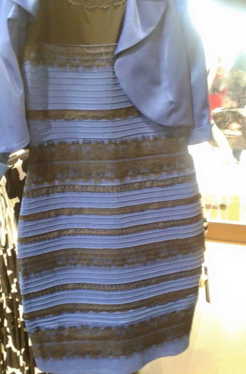
You probably remember “The Dress.” The internet phenomenon that divided the nation back in 2015. Half the population insisted it was white and gold. The other half couldn’t understand how anyone could miss that it was blue and black. More than a decade later, we still love to debate it.
This internet craze is interesting because it wasn’t necessarily the actual dress people were reacting to. It was a poor-quality photograph taken on a 2015 phone. The photograph was missing so much color data that our brains were forced into auto-mode to fill in the gaps. Some brains filled the gaps with blue and black. Some brains filled the gaps with white and gold. Nobody consciously chose what they saw. Their brains naturally filled in the missing information.
That’s the magic of perception.
Two people can stand side by side looking at the exact same thing and walk away describing it differently.
Color doesn’t exist on its own. It’s always interacting with the world around it and the people experiencing it.
With so many variables influencing how we perceive color, you can imagine the challenge this created for the printing industry. As modern commercial color printing expanded, color perception became impossible to ignore. The industry needed a way to communicate color consistently, regardless of who designed it, who printed it, or where it was produced. That led to the idea of using numbers to standardize color. Systems like CMYK, RGB, Pantone Matching System, Hexadecimal, and sRGB were all born from that pursuit.
And honestly? It worked.
It’s the reason Coca-Cola is consistently the same recognizable red whether it’s printed on a billboard, a soda can, or a cardboard box halfway around the world.
Unfortunately, assigning a number to a color only solves part of the problem.
Take the image of the winking girl, for example. Most people would bet their mortgage that her face is two distinctly different colors.

It isn’t.
Factually, every pixel on her face is exactly the same color in both images. The numbers prove it. Her face is R125-G125-B125, Hex #7D7D7D, or CMYK 53%, 44%, 44%, 9%.
Her face isn’t changing. The colors surrounding it are.
Even when we’re using the very numbers designed to eliminate subjectivity, the brain grabs the wheel and says, “Nice try.” Sunlight, artificial lighting, surrounding colors, and visual context all influence how we experience color.
Isn’t that wild?
If these images can make us question something as fundamental as color, imagine what it must feel like to have “getting color right” as part of your job description.
By the time a project lands in our building, color has already traveled through a surprising number of hands and perspectives. A marketing team approved it. A designer built it. Someone viewed it on their 15-year-old laptop. Someone else approved it on a phone perpetually stuck in night mode. Every step introduced another opportunity for perception to quietly shape everyone’s expectations of the final color.
That’s the uphill battle our press operators face every single day. Not because they are bad at color. In fact, they are exceptional. They spend their days relentlessly navigating every variable that influences how we experience color. If that sounds a bit overwhelming, here’s what’s waiting for them once a job actually reaches the press.
The moment ink hits paper, your perfectly selected brand color begins interacting with the real world. If you switch to a different paper, the color will change. If you add a coating or treatment, it changes again. As the ink dries, the color continues to shift.
Even the weather forecast can introduce a whole new set of variables. Temperature and humidity influence how the ink behaves and how the press responds. Our press operators aren’t just managing ink and equipment. They’re constantly adapting to a moving target.
At this point, we should probably have our operators check their daily horoscope and factor in the Dow Jones Industrial Average, because it starts to feel like everything plays a role in getting color right.
The funny thing is, none of that discourages good printers. If anything, it’s exactly what makes them care so much.
A printed pull sheet doesn’t get approved the moment it comes off the press. It gets walked through three different rooms. It gets taken outside. We scratch our heads over it on purpose, because we already know our own eyes can lie to us just as easily as anyone else’s. We know we can’t rely on a single glance or opinion. That’s why we’ve built multiple safeguards into our process. Those safeguards give us multiple opportunities to verify color before a job is approved.
We can’t fix perception. Nobody can. But we can refuse to shrug at it. That’s why our press is calibrated to G7 standards, why our console lighting doesn’t get to have an off day, why we check color with instruments instead of wishful thinking. Not because we think we’ve beaten the problem, but because it’s our job to minimize the variables.
Sometimes getting color right isn’t about achieving perfection.
Sometimes it’s about refusing to stop pursuing it.
PRINT NW Has a Custom Solution For You
Printing & Packaging
Print NW has the tools to deliver a wide array of printing solutions and products.
To Printing>Indoor & Outdoor Signage
Whether you’re looking to outfit your business with new indoor/outdoor signage, or want to advertise the products, we have a sign to fit your needs.
To Signage>Apparel & Promo Products
Print NW works with you to create the best products, from grab-and-go promotional items to full-service digital apparel stores.
To Apparel>HOW CAN
WE HELP?
Do you have a product idea you don't already see on our website? No problem! Our sales representatives are ready to work with you to create a custom solution.